Tips for Using PowerPoint™ for Academic Presentations
Content
Adapted from A Practical Guide to Using Computers in Language Teaching, University of Michigan Press, 2005.
THE SLIDESHOW is a visual supplement to your presentation, not the presentation itself. At best, it can only help illustrate your points, not give your presentation. What you say is the main event. Spend more time on what you plan to say than creating the slideshow. Be careful that your slideshow provides a visual supplement to what you say instead of limiting what you say or distracting you or your audience. Most of these tips apply to any slideshow presentation program (aka slideware), not just PowerPoint.

1. Finish text first. Write your text or outline first, spell check it, and double-check the grammar. People will be looking at what you've written—because they'll have little else to do—and will notice any mistakes.
2. Content before form. Don't get caught up with clip art, animations, transitions, sounds, etc., before finishing your text—if at all. Focus on content before form, just as in your writing.
3. First and last slides. Your first slide should be a title slide and the last a closing slide, either may stay visible to your audience for considerably longer than any other slide. Make both informative and interesting.
- A title slide should include your name, presentation title, and class information with a relevant, complex graphic to stir interest.
- A closing slide should include your contact information and references for further information.
Mechanics
Text4. Slides. A slideshow is basically made up of a series of slides, each having text objects and/or graphic objects arranged around each other or the text overlaying (placed on top of) the graphic.
5. Templates/AutoContent Wizard. New users might be attracted to PowerPoint's built-in templates (ready-made designs) or the AutoContent Wizard. Templates provide a background design and layout of text in header-bullet format. The Wizard attempts to build content for you through a question-and-answer process. AVOID USING BOTH OF THESE TOOLS! Viewers recognize and hate them. More importantly, they will corrupt your message. They make grossly inefficient use of space and dictate the meaningless bullet list format.
6. Background images. If you use a background image for custom slides (on a master slide), select the Watermark option on the image toolbar (Picture Toolbar > Image Control > Watermark). Be careful. The background image should not interfere with the readability of the foreground content at all. Resize the image in PP to fit the slide. Crop if necessary to fill the entire slide.
7. Section large presentations. For large presentations with several distinct sections, consider using a different color slide background to distinguish each section, such as different page or margin colors might be used for chapters in a textbook.
Opening the master slide to edit.
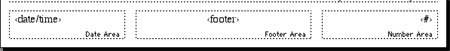
8. Master slide. For items or content that will repeat on every slide (e.g., slide number, title, author, copyright information, etc.) use a master slide. Each new slide will then contain these elements automatically. Think carefully about whether or not you really need this information displayed. How will your audience use it or benefit from it?
The bottom "footer" area of the master slide. These items will appear on every slide.9. Compatibility. PowerPoint applications of the same version are the same on Macs and PCs. It's the same file format. They are equally backwards compatible; that is, they can open documents created on either platform from earlier versions of the application. PP on Macs or PCs is not forward-compatible; that is, for example, PowerPoint in Office 2004 cannot open the OpenXML version of .pptx produced by Office 2007/2008. more information...
10. Mouse functions. On PCs, access common PP commands using the right mouse button. On a Mac with a one-button mouse, access the same commands using the Control key with a mouse click (or use a two-button mouse on the Mac just as you do a PC).


Graphics, animations, transitions11. Size matters. Text on a slide is much larger than printed text because it must be readable from the back of the room during the presentation. Default point sizes for text, therefore, range from about 40 points for headings to 20 for subtitles or list items.
12. Fill slides. Slides have very poor information density, which means they are not good at presenting a lot of information in one eyescan. Don't make this worse by making your text larger than you have to or by reducing the size of graphics. Use as much of the space as possible, from corner to corner, top to bottom. Because of these space and density limitations, many users feel forced to use the list, or • bullet, format using key words instead of complete sentences. However, if your meaning will be distorted or diluted in this format, write complete sentences. Unlike printed type, a slide is not meant to be read as a stand-alone document (except in kiosk mode) but rather highlight facts, figures, salient points, etc., which you explain in more detail and connect with a narrative—still the most important part of your presentation!).
13. Text boxes. Adjust the size and shape of text boxes to accommodate the length of text contained within them and work around adjacent pictures, unless using text wrap on the graphic object or overlaying the graphic with the text. If a graphic or text box has the text wrap feature enabled, then text automatically flows around it on the same line.
14. Fonts. Don't use nonstandard fonts. PowerPoint is machine-dependent, which means that if you choose to use the font "Bodini MT Ultra Bold," then any computer that plays that slideshow will also have to have that font installed. If it doesn't, then it will substitute another and your layout will likely change, including text that overruns its box and no longer displays in its entirety on a slide. Fonts standard to most computers, Macs and PCs, include Arial, Courier, Georgia, Helvetica, Palatino, and Times New Roman. Stick to the default font that PowerPoint gives you and you'll be fine.
Printing/Saving15. Effective images. Use relevant pictures and graphics—staring at text alone on a slide is boring—but AVOID THE BUILT-IN CLIP ART gallery. Clip art is silly, generic, and not illustrative of anything meaningful.
16. Picture=1,000 words. An image conveys far more information than text filling the same space. Enlarge important images to fill the entire slide rather than sacrificing image size to accommodate text that's not critical to the point or doesn't need to be shown.
17. Object layers. Graphic and text boxes each occupy a layer on the slide, the order of which can be changed forward and backward (see menu at right). Text can overlay an image by adjusting the order of the text box to bring it to the front (Draw menu > Order).
18. Empty space. The lower left corner of a slide may develop space for a small, related graphic when using text in indented lists, which move farther and farther to the right. Again, if it's an important or highly detailed image, give it its own slide and maximize the size.
19. Image size. Resize graphics proportionally (changing height and width by the same percentage) using one of the four corners of the graphic box. The resizing handles in the middle of the sides will only stretch the X axis (top, bottom) or Y axis (sides), thereby distorting the shape of the image.
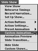
20. Animation. In general, avoid animating objects. Text cart-wheeling onto the slide might seem amusing, but it usually isn't to viewers over 12 years old. Iit distracts from the message with a sophomoric effect. Animations also tend to look cooler on your computer screen than they do projected before an audience. Use functional animation effects, such as in a text box where successive lines appear one at a time to coordinate with your talking about each in turn. Delay showing text or graphics on a slide for suspense or to allow the audience to guess or predict it.
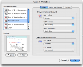
(Left) Select a text box first then set Custom Animation effects.
(Below left) Custon Animation shows all animated objects on this slide and one selected. The Effects tab controls appearance of effect and the Order and Timing tab (below right) how much text will come in at a time (by letter, word, line, or all text).
in Effects, choose which objects, text or graphic, are to be animated on the slide. Choose effect (Appear only!).
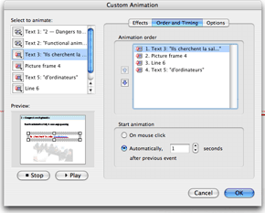
Then click on Order and Timing and choose the order in which objects appear on screen.
21. Transitions. If using transitions between slides, pick one that goes to the next slide quickly and stick with it. Using a different transition between every slide distracts from your message. A transition that opens up from the center, like a camera lens, opens up a new topic; one that closes to the center ends a topic. Simple right-to-left transitions ("push left" or "wipe left") corresponds to how we experience text on paper while clearly signaling that the slide has changed.
22. Sound. If you add sound to your presentation, you will need to amplify it for a large audience. At the very least, the computer or laptop running your presentation should have external speakers that can be aimed toward the audience. Sound files that play automatically when a slide appears may greatly slow down your slideshow (how fast a slide loads and can be exited) and increase its file size. DO NOT USE POWERPOINT SOUND EFFECTS FOR ANYTHING. They are frivolous and add nothing to your content.

23. Saving. Save your presentation file early and often. The default saving format is "Presentation" (.ppt), which is an editable version. When sending a finished presentation to someone, use the "PowerPoint Show" (.pps) file type in the Save As... dialog box, a read-only format that cannot be modified and opens automatically in slideshow mode (full screen). (See note about the OpenXML format (.pptx) of Office 2007 and compatibility problems.)
24. Place-holder text. Place-holder text is text on slides from built-in templates, e.g., "Click to add title," that you replace with your content. It does not print; therefore, you don't have to delete the box if it's not being used.
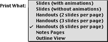
Printing multiple slides on a page is more practical to use and cuts down on paper.
25. Printing. To practice your presentation without a computer, print out the slides. Use the 4-up or 6-up printing option (under "Print What") to print 4 or 6 reduced—though still easily readable—slides on each page to save paper and allow you to see the next slide while thinking about what you'll say for the current one. You can also print notes under each slide that do not appear in the slideshow.
Other Presentation Resources See the PowerPoint primer (pdf) for more detailed instructions on making presentations. See Intelligent Use of PowerPoint for more discussion on how to avoid corrupting your message with this tool. PowerPoint Is Evil: Power Corrupts. PowerPoint Corrupts Absolutely (Edward Tufte, Wired Magazine) Edward Tufte interviewed on NPR (Weekend Edition Sunday, 8/20/06) |
