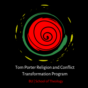
About Our Logo
 The elements of the logo of the Tom Porter Religion and Conflict Transformation Program represent different aspects of the history of the program, the work of conflict transformation, and the values of the School of Theology. It was created in 2023 by Dr. James McCarty in collaboration with the student staff that year: Rachel Barton, Justin Brothers, and Ali Wantimba.
Circles:
The logo is made up of multiple circles. These circles represent the importance of peacemaking circles to the program. Peacemaking circles – and healing circles, talking circles, accountability circles, and others – are a practice that emerges out of North American Indigenous peacemaking practices. In particular, the tradition of circles that informs and is practiced at the School of Theology traces its lineage to teachers from Tagish and Tlingit nations in modern-day Alaska and British Columbia. Harold Gatensby, Phil Gatensby, and Mark Wedge are just some of the Tagish Tlingit teachers who have taught our teachers and inform our attempts to practice and live circles in a good way.
Spiral:
You will notice a spiral in the middle of the circles. The spiral represents the ongoing work of peacemaking and conflict transformation. Whereas a circle might represent a closed loop of transformation, the spiral reminds us that this work is always ongoing, always evolving, and always returning. In addition, the spiral is a reminder to get out of linear frameworks of justice, peace, and transformation and that the seeds of peace we plant may not bloom until generations after us.
Layered:
The various circles in the logo are layered – a reminder that conflicts happen at multiple levels and in multiple places in our lives and in our societies. Conflicts can be interpersonal, communal, organizational, and structural. They arise between friends, in neighborhoods, in religious communities, and in societies. The layers of circles in the logo remind us of the need to pay attention to the various levels of conflict in any situation, in the words of Maire Dugan that conflict is “nested,” and to be attuned to the ways the levels and layers of conflicts are necessary for any transformation to be possible.
Red, Yellow, Green, Black:
You will see that the colors red, yellow, and green are prominently displayed in the logo. These colors can be found on flags across the African continent and have come to represent ideas of Pan-African solidarity. The history of anticolonial and liberatory movements on the continent remind us that conflict transformation is not always about minimizing or “resolving” conflict. Rather, conflict transformation is about transforming conflicts into experiences of liberation – sometimes by escalating them!
Ubuntu:
In addition to the colors red, yellow, green, and black serving as a reminder of the importance to transform conflicts toward liberation, the colors of the logo (including white) are a part of the South African flag and represent the Indigenous southern African philosophical and theological idea of ubuntu that Archbishop Desmond Tutu taught the world. Ubuntu is a way of describing human interconnectedness and interdependence. In the words of Tutu, “I am because we are.” These colors also serve to remind us that the spirit of ubuntu, of interdependence, undergirds the work of conflict transformation.
The History of BU:
The names of the program and school, in BU colors red and white, recall the great history of the School of Theology as the “school of the prophets.” Anna Howard Shaw, Howard Thurman, Walter Muelder, Martin Luther King Jr., James Lawson, Delores Williams, and Tom Porter are just some of the great figures who have walked our halls and contributed to the transformation of oppressions and violent conflicts into more justice, more peace, and more reconciliation. We in the Program are proud to stand in the shadows of these and many other prophets who have called BU STH home.