The New New Typography
Jan Tschichold was a man who wasn’t afraid to change his mind—twice. An influential figure in the history of graphic design, Tschichold is best known for his 1928 book Die neue Typographie, which called for a revolution in the way words and images are set on a page, and emphasized bold and modern design choices, like asymmetrical layouts and sans serif fonts.

Richard Doubleday
What’s less well known, says Richard Doubleday, an assistant professor in the College of Fine Arts, is the way in which Tschichold later reined in these modernist impulses, in another design manual called Typographische Gestaltung, published in 1935. Having been commissioned to write entries on two early works by Tschichold for an anthology on graphic design (forthcoming from Phaidon), Doubleday found himself moved to write a third essay, on Typographische Gestaltung, to be published in Baseline International TypoGraphics magazine.
“I felt that this book in particular needed some light,” says Doubleday. “Graphic design is not unlike any other field, where in order to do contemporary, groundbreaking, pioneering work, one needs to have a solid understanding of the history of the discipline. In order to go forward, one needs a good, firm understanding of the past.”
The son of a sign painter, Tschichold took an interest in design at a young age. As a teenager in Leipzig, Germany, during World War I, Tschichold frequented the city’s library, immersing himself in Renaissance typography and classical design.
“Graphic design is not unlike any other field, where in order to do contemporary, groundbreaking, pioneering work, one needs to have a solid understanding of the history of the discipline. In order to go forward, one needs a good, firm understanding of the past.” Richard Doubleday
And then, in 1923, everything changed. “Tschichold went to the Bauhaus exhibition,” says Doubleday, “and he was like, ‘Whoa! What’s going on here?’ It completely altered his view on design.” Inspired by the work of constructivist painters and other avant-garde artists, Tschichold became a leading—and extremely zealous—advocate of modernist design.
When the Third Reich came to power, Tschichold sought protection and patronage in Switzerland. His new bosses were conservative Swiss publishers, his new projects were mostly books. The asymmetry and bold design principles of the New Typography—which work terrifically well on a poster, but would be exhausting in a 500-page novel—had to be adjusted. In Typographische Gestaltung, Tschichold laid out his revised design principles.
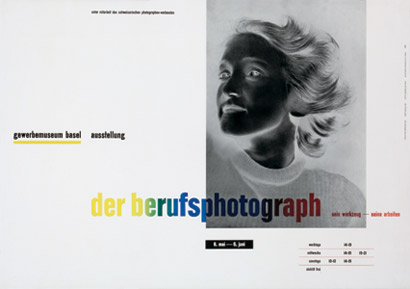
Jan Tschichold influenced the daring, asymmetrical aesthetic of the New Typography movement, seen in this poster, and set lasting standards for book design.
“Maybe he felt that the pendulum had swung as far in the direction of New Typography as it was going to swing,” says Doubleday. “And maybe he began to realize that the classic approach was perhaps best for works of literature.” Tschichold was heavily criticized for changing his views, particularly because he had been such a vocal proponent of New Typography before.
“But we have the right to change,” says Doubleday, who has also written about Tschichold’s time at Penguin Books, where the designer set new standards for book production in England. “He changed to appropriate the design for the content. And often designers with 30- or 40-year careers kind of go full circle. Tschichold was coming home in a way, I think, to his design home.”
Even so, he had clearly tapped into something with his Die neue Typographie, a work that young designers still respond to with great enthusiasm today. “A lot of my graduate students love the New Typography,” says Doubleday. “I know I did when I was first a student of design. They’re simple, they’re beautiful. And working in a simple direct way like that, it’s not as easy as it looks.”