Stick Figures Fighting COVID-19.

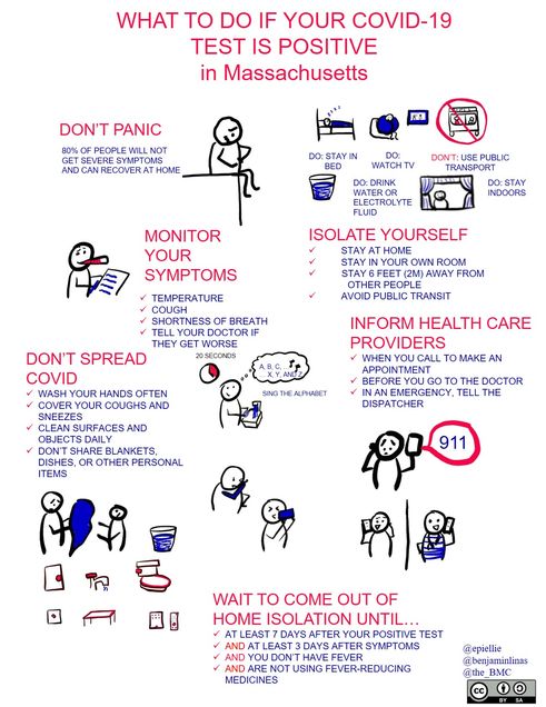
In the midst of the COVID-19 pandemic, Boston Medical Center (BMC) patients now receive factsheets about how to protect themselves and others from the new coronavirus, what to do while waiting for test results, and what to do if they test positive—all in the form of cartoons created by School of Public Health faculty.
Eleanor Murray is the first to admit that she doesn’t draw very well. A few years ago, to de-stress, she decided to work on at least being able to draw good stick figures. And soon, she realized that those stick figures had a job to do.
Murray joined SPH as an assistant professor of epidemiology last year, but she was already known to much of the school community on Twitter as @EpiEllie, where she communicates often-complex epidemiological concepts in simple and often funny ways on #epitwitter. Gifs have long been the go-to for her epi threads, but her stick figures soon took off.
So, when Benjamin Linas, associate professor of epidemiology at SPH and of infectious diseases at the School of Medicine, was tasked by BMC with creating a fact sheet on COVID-19 for patients, he reached out to Murray.
“Rather than just giving people another text page that they’re probably not going to look at, he thought it would be way more useful to give them something fun and visual,” Murray says.
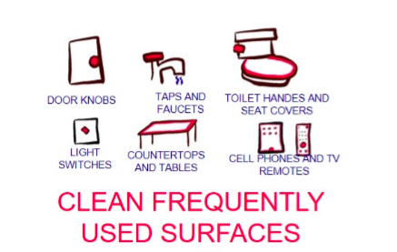
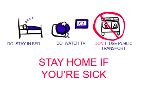
The first cartoon shows Murray’s stick figures enacting Linas’ five tips. With the help of BMC and Twitter crowdsourcing, the cartoon is now available in over a dozen languages (and multiple Spanish dialects).
 Linas and Murray are now working on a whole series of these cartoons, with instructions for patients who have tested positive for COVID-19 and for other scenarios.
“COVID-19 is really scary for people, and there’s a lot of uncertainty and a lot of discomfort, so being able to inject some levity and some clarity into the messaging around it is really useful,” Murray says.
“People can actually do things to protect themselves, and those things are really simple—stay a little further away from people than you normally would, and wash your hands with soap and water,” she says. “It’s a really simple message—but, if you just put it on a piece of paper, it sounds too simple.”
Putting it in a cartoon, on the other (well-washed) hand, makes it clear that the message is a real set of important instructions.

The distrust of simple-looking epidemiology is the reason Murray started using gifs and stick figures in the classroom and on Twitter in the first place.
“Sometimes really simple mathematical tools will get us the right answer, and sometimes we need really complicated tools—but a lot of people have this misconception that, if it’s not really complicated, then it’s not right,” she says. “That’s just not true.”

It’s a misconception now running rampant as the phrase “I’m not an epidemiologist but…” becomes a common refrain among people trying to make sense of the spread of COVID-19.
“Those really specific, really mathy, really technical-looking graphics are much more likely to be wrong,” Murray says.
“A lot of people are saying, ‘Hey, this is a topic people are interested in hearing about, and the data are accessible, so I’m going to run a model that I’ve never run before, or a type of model that I’ve never run before, or a model I know how to run but never for an infectious disease before. I’ll make a graph. It will look really specific.’
“But, it will be based entirely on assumptions, because, at this point, we really know very little about the SARS-CoV-2 virus—and people who have never done any infectious disease epi know even less than the infectious disease epidemiologists who are spending all of their time working on this.”

That’s dangerous, Murray says: Whether those technical-looking graphics say that everything is fine or that it’s time to start panicking, the bottom line is that people will act on something other than the best information available.
Instead, Murray encourages the epidemiology community to take advantage of the unprecedented attention turned their way, “and help people understand what we do, and put out good explainers,” she says.
In uncertain times like these, Murray says, the best information to share is the vetted, tried-and-true epidemiological concepts, such as “flattening the curve,” or what “risk” actually means, in simple, clear, and engaging ways.

“It would be so valuable if doctoral students, or postdocs, or faculty, or people who are thinking about getting into science communications, started with some of these really simple concepts and tried making their own versions of ‘cattening the curve,’” she says. “I’d much rather see 100 different ways of explaining risk that could go viral, rather than a whole bunch of data visualizations making really poor assumptions.”
All of the fact sheets and translations are available here.
Comments & Discussion
Boston University moderates comments to facilitate an informed, substantive, civil conversation. Abusive, profane, self-promotional, misleading, incoherent or off-topic comments will be rejected. Moderators are staffed during regular business hours (EST) and can only accept comments written in English. Statistics or facts must include a citation or a link to the citation.