18 Charts That Make the Case for Public Health.

As we resume our weekly schedule of Dean’s Notes, an acknowledgement of recent events. First, the floods in Louisiana, and the earthquakes in Italy and Myanmar, remind us of the ever-present threat of sudden disasters, and the power of these events to strain the physical and social infrastructure of the places they affect. I have written before about how public health must prioritize disaster preparedness. Going forward, we must continue to emphasize investing in the social, economic, and environmental foundations that support communities, so that these communities might be better positioned to bounce back in the wake of these devastating occurrences.
We have also been shocked by the continued violence we have seen—both the attack at the American University of Afghanistan in Kabul, and the recent suicide bombing in Turkey. These atrocities highlight the public health consequences of hate, and reinforce our collective responsibility to mitigate the forces of anger and unreason in our world through empathy, inclusivity, and by limiting the proliferation of deadly weapons in our society.
All of these events are tragic, and represent an unfortunate note on which to begin a school year. Yet they also underscore the importance of our efforts, challenging us to work with renewed energy and focus towards our goal of healthier populations.
Moving on to this week’s Note.
Over the past year, I have often been involved in conversations with audiences who are interested in understanding the concerns of public health. Through this dialogue, I have found that the motivations and concerns of public health can be explained through a series of graphs. Accompanied by these graphs, I summarize below the narrative of our field, in the hope that these visual aids may be useful to all members of our community, as we work to communicate the goals and aspirations of public health.
I start with a domestic motivation for public health, recognizing that motivations are indeed personal and must resonate with our communities.
The US has substantially worse health outcomes than all its peer nations. By way of example, Figure 1 shows noncommunicable disease mortality in 17 high-income countries; the US has the second-highest death rate at 418 deaths per 100,000 people, more than 50 percent greater than that of Japan. Although American life expectancy has improved over time along with that of other countries, it has improved at a slower rate, resulting in the US falling substantially behind our peers.
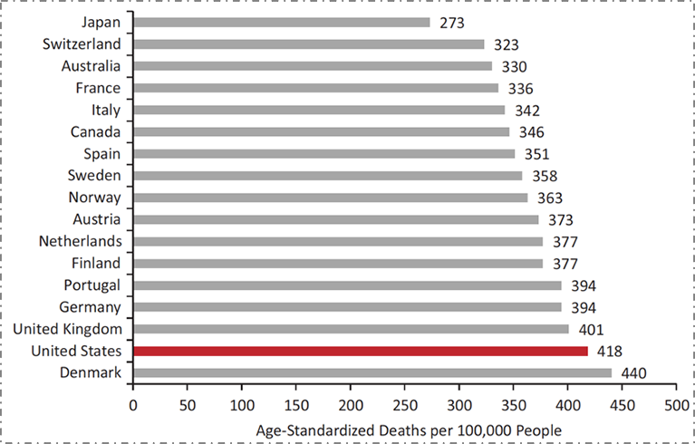
Data from World Health Organization. US Health in International Perspective. Shorter lives, poorer health. S Woolf, L Aron, eds. NRC and IOM. 2012.
The poorer health of the US compared to our peer nations is generally well understood. What is often less well understood is that we have not always been this far behind our peers. As we see in Figure 2 below, focusing by way of illustration on female life expectancy at birth, the US was in the middle of the group of peer countries as recently as 1980. However, in the intervening 35 years, while all countries have improved, we have improved at a far slower rate, falling behind.
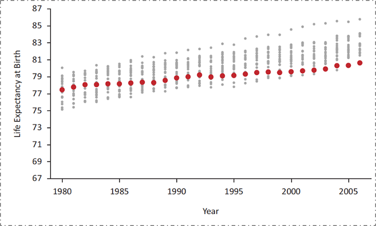
Data from the National Research Council, 2011. US Health in International Perspective. Shorter lives, poorer health. S Woolf, L Aron, eds. NRC and IOM. 2012.
These poor health indicators are not the result of a lack of investment in health. The US spends far more on health than any of these other countries, and our rate of spending is increasing. Figure 3 shows average health care spending per capita across a similar set of high-income countries; US health spending is higher than the others and the gap has been increasing over time.
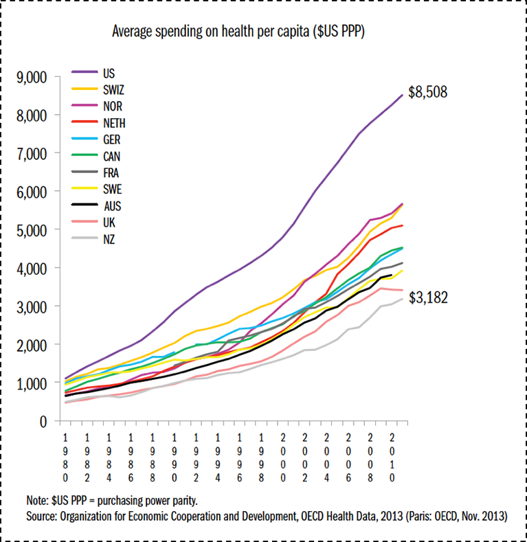
Data from OECD Health Data 2011. The Commonwealth Fund. http://www.commonwealthfund.org/~/media/files/publications/fund-report/2014/jun/1755_davis_mirror_mirror_2014.pdf. Accessed May 30, 2016.
What, then, explains the mismatch between our spending and the health indicators we are able to achieve? Although we have higher mortality rates overall than our peer countries, our ranking on health indicators is not distributed evenly across the lifecourse. Figure 4 shows that while we have the worst mortality outcomes among our peer set throughout most of the lifecourse, at the very end of the lifecourse we actually move to the best. It turns out that the US has the best health indicators when one is over 80 years old; this however has come at the expense of the cost of health for all other ages. This of course reflects the medicalization of “health” investments in the US, our disproportionate spending on the curative, and our focus on tackling disease rather than creating health. Our enormous expenditures on all forms of medical care, including end-of-life care, result in suitably commensurate health indicators at the upper extreme of life, while our comparative poverty of spending on the conditions that make people healthy has resulted in us having worse health indicators than our peer nations for all but the oldest age groups.

Adapted from Ho and Preston, 2011. US Health in International Perspective. Shorter lives, poorer health. S Woolf, L Aron, eds. NRC and IOM. 2012.
This challenge is not only national—it is present even here in Boston, the city with the highest proportion of physicians compared with any other city in the US. I return to the T-stop map that I introduced in a previous Dean’s Note. Figure 5 shows the percent of adults living with diabetes in various neighborhoods in Boston, all within just a few miles of each other and just a few T stops away. The diabetes prevalence among residents of Maverick, Dudley Square, and Mattapan are three to four times greater than those of the wealthier areas around Back Bay and Fenway.

Data from Health of Boston 2012—2013: A neighborhood focus. http://www.bphc.org/healthdata/health-of-boston-report/Pages/Health-of-Boston-Report.aspx Accessed May 30, 2016. Boston Public Health Commission.
These differences cannot be explained by differences in medical care. The stark variation in diabetes prevalence in these neighborhoods belies the presence of leading medical facilities physically close to all of these areas, as seen in Figure 6. This speaks to the reality that deep-seated inequalities in health cannot be fixed by medical care alone. While issues of access and cost, among many other factors, contribute to lower-income Boston residents not being able to fully capitalize on the medical facilities that surround them, this is but one relatively small part of the challenge, a challenge which shall require an “all in” engagement with the foundational determinants of health if we are to genuinely make a dent in improving the health of populations.

Compiled using Google Maps.
At core, the production of health is multifactorial, driven by factors across the lifecourse and across levels of influence. There is no ready way of quantifying how these various levels influence health, but perhaps as good an estimate as any comes from the Network for Excellence in Health Innovation, which estimates that a large majority of health is determined by our environments and behaviors, as shown in Figure 7. In this example, only about 6 percent of the production of health was attributable to medical care or access to medical care. This of course is in sharp contrast with our spending: almost 90 percent of our national health expenditure is spent on medical services.
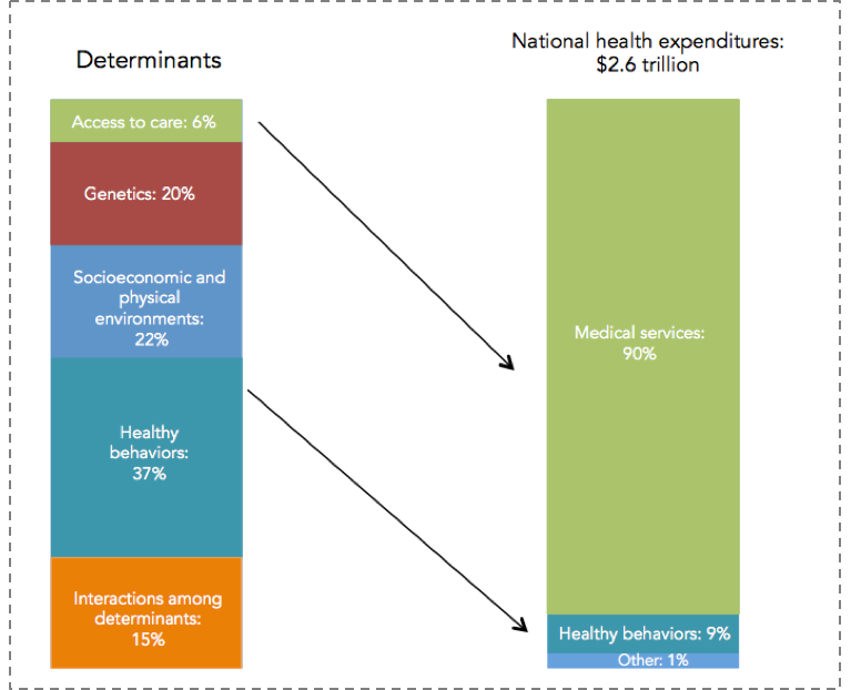
Healthy People/Healthy Economy: An Initiative to Make Massachusetts the National Leader in Health and Wellness. 2015. Data from NEHI 2013. http://www.tbf.org/tbf/56/hphe/Health-Crisis. Accessed May 30, 2016.
This leads directly to the remit of public health: We must focus on the social, economic, and cultural conditions that make populations healthy, moving away from the curative approach that characterizes the US investment in “health” towards a greater investment in the foundational determinants of well-being.
If we aspire to promote the health of populations, we must therefore do so not by increasing spending, but by spending more strategically on the foundational conditions that shape the health of populations. This is perhaps best shown in Figure 8 below.

The Commonwealth Fund. http://www.commonwealthfund.org/publications/issue-briefs/2015/oct/us-health-care-from-a-global-perspective. Accessed May 30, 2016.
When one combines spending both on medical care (and I would argue that the light blue bar above would be better labeled “medical care” than “health care”), with a broad range of social investments in the resources that can create the health of populations (above labeled “social care”), US spending is roughly in the middle of the pack compared to peer nations. We are spending more on medical, curative care, but far less than other nations on building the conditions that make people healthy.
Soberingly, this narrative is true both in the national and the local context. In Massachusetts, we have seen government medical spending increase by 81 percent over the past decade and a half, as shown in Figure 9. Unfortunately, as we have spent more money on medical care, we have spent less on the larger determinants of health such as education, early childhood care, the environment, and even public health as a practice itself. While there is clearly a growing global appreciation of the centrality of the social determinants of health, this appreciation is far from reflected in how we as a Commonwealth have been spending our resources.
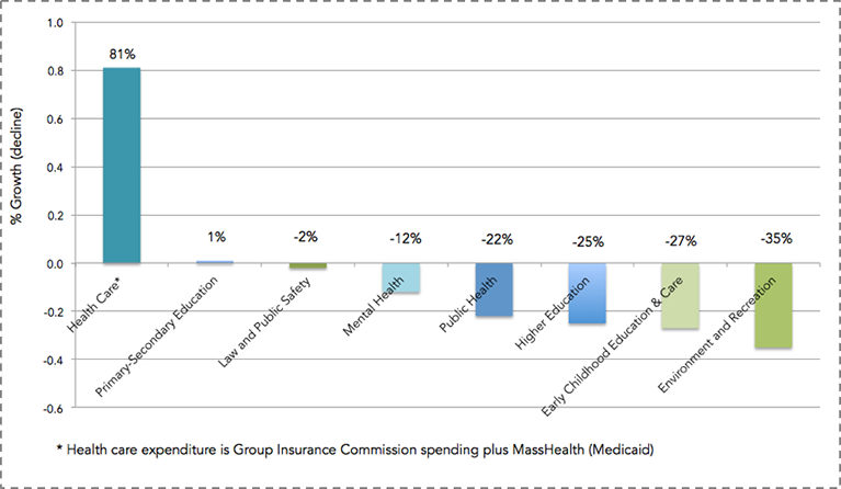
Healthy People/Healthy Economy: An Initiative to Make Massachusetts the National Leader in Health and Wellness. 2015. Data from Massachusetts Budget and Policy Center Budget Browser. http://www.tbf.org/tbf/56/hphe/Health-Crisis Accessed May 30, 2016.
Our collective investment in a curative approach, which is to say our focus on how we can make the individual better, extends well beyond our increased spending on medical care. Our research enterprise has, over the past decade, focused ever increasingly on funding individual approaches, moving us away from scholarship around the foundational determinants of population health. With the rise of genomics, and most recently the Precision Medicine effort, much of that funding has driven efforts aimed at genetic and molecular targeting. It is perhaps not surprising, then, that this comes at the price of funding population health. As calculated through the National Institutes of Health (NIH) research portfolio online reporting tools and graphed below (Figure 10), the proportion of NIH funded projects that included the terms “population” or “public” in their titles has fallen tenfold over the past decade.

NIH RePORTER. Search results for projects for which funding data is available. http://projectreporter.nih.gov/reporter.cfm Accessed November 20, 2014.
We are therefore seeing a picture of increasing US disinvestment in the social, cultural, and economic conditions that create health—the core concerns of public health—with attendant consequences for our poor national health indicators in the short-term. This leads to the worry that we are positioning ourselves to do even worse in the long-term, as we decrease our research investment in these foundational concerns.
What, then, are these economic, social, and cultural conditions? How might we view them?
A few pictures tell the tale. Consider the role of income in determining health. Life expectancy has increased over time in the US, but it has done so enormously heterogeneously, with higher income groups gaining in life expectancy and lower income groups either not gaining, or losing. Figure 11 below illustrates this point. The figure shows two birth cohorts—men born in 1930 and 1960—and estimates their life expectancy at age 50. As can be expected, the life expectancy for the 1960 cohort is higher overall than for the 1930 cohort. It is, however, lower for the poorest quintile of men, meaning that men born in 1960 can expect to have less life left at age 50 than their counterparts born in 1930. In addition, the gap between quintiles is widening. While the gap between the richest quintile and the poorest quintile for those born in 1930 was 5.1 years, that same gap is 13.6 years for those born in 1960. Simply put, the health of populations is inextricable from economics, and health gaps and wealth gaps go hand in hand. I also note here that racial/ethnic divides in this country map frequently onto economic divides and are very much a part of the picture of health production in the US.
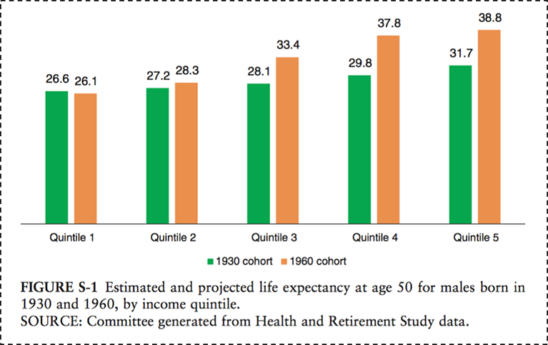
National Academy of Medicine. 2015. http://www.nap.edu/download.php?record_id=19015# Accessed May 30, 2016.
Figure 12 below illustrates the consequences of rapid shifts in social conditions and causes, focusing on the mortality rates over time of middle-aged white Americans compared to our peer countries. While all other group mortality rates have declined since 1990, the mortality among US white, non-Hispanics has increased. This is potentially due to an epidemic of non-intentional drug overdoses, largely attributed to the over-prescribing of pain medications in recent years. The cause-specific mortality rate from drug overdoses in the US tripled between 1990 and 2006, and this increase has largely been concentrated in this group.

Case A, Deaton A. Rising morbidity and mortality in mid-life among white non-Hispanic Americans in the 21st century. Proceedings of the National Academy of Sciences. 2015; 112(49): 15078–15083.
Focusing on culture, one is drawn to the narrative associated with one of the past century’s biggest public health milestones—the introduction of vaccines, which has saved the lives of millions of children. Figure 13 shows the dramatic decrease of measles incidence across the US after the introduction of a measles vaccine in 1963. But recent controversy, and the rise of the anti-vaccine movement, has pushed back on some of this progress despite no scientific evidence to back concerns, resulting in a re-emergence of measles cases as shown in the darkening blue to the right of the graph, starting around 2004.

DeBold T, Friedman D. Battling Infectious Diseases in the 20th Century: The Impact of Vaccines. The Wall Street Journal, February 11, 2015. http://graphics.wsj.com/infectious-diseases-and-vaccines/ Accessed May 30, 2016.
I have focused much of my attention here on the US, mostly by way of grounding our motivation in the familiar local context. But the concerns of population health are emphatically global in scope, and the drivers of population health are as much rooted in the foundations of health worldwide as they are in the US. Figure 14 scales the world’s geography by preventable deaths, showing how extraordinarily fortunate we are in our health achievement in the US (and in our peer countries), and illustrating the heavy burden of preventable death in Africa and southeast Asia.

http://www.worldmapper.org/display.php?selected=1 Accessed May 30, 2016.
It is not surprising, therefore, to note in Figure 15 below that this picture maps well onto the picture of global poverty; a stark reminder both of the disproportionate global burden of poor health in low-income countries, and the inextricability of this poor health from the economic status of these countries—focusing our energies and attentions on what needs to be done if we are to promote the health of global populations.

http://www.worldmapper.org/display.php?selected=1 Accessed May 30, 2016.
A global perspective also gives us the chance to identify the international trends that are becoming ever more ubiquitous, and the forces with which we must come to grips if we are to improve the overall health of populations. Two central such forces, probably the two most important demographic shifts over the past century, stand out: urbanization and global aging.
Urbanization has increasingly characterized the conditions within which we live. The map below, Figure 16, shows in dark blue the countries that are projected to have more than 50 percent of the population living in urban areas by 2050. Almost every single country is in dark blue; this is a very different picture than we saw 50 years ago. Cities are characterized by pollution, overcrowding leading to infectious disease, and the strain of health systems. But because cities represent a ubiquitous presence in the lives of global populations, urbanization is also an opportunity to think about how we may create healthier cities to the end of improving the health of populations worldwide.

Population Division of the Department of Economic and Social Affairs of the United Nations Secretariat, World Population Prospects: The 2006 Revision and World Urbanization Prospects: The 2007 Revision. http://esa/un.org/unup.
Coincident with the rise of urban living, the world is being transformed, as shown in Figure 17, by an aging population. The proportion of people over the age of 65 is projected to be about three times as large as that of people under the age of 5 by 2050. In 1950, these proportions were reversed. I have commented previously on the potential to view global aging as an opportunity to create a world where aging well and productively are the hallmarks of a better world, and healthier populations.

National Institute on Aging, National Institutes of Health. US Department of Health and Human Services, World Health Organization. http://www.nia.nih.gov/sites/default/files/global_health_and_aging.pdf Accessed May 30, 2016.
I note, importantly, that two of the four research themes that emerged from our school-wide strategic thinking effort are urban living and aging and wellness, positioning us well to move where the world is headed, innovating in population health scholarship, education, and action towards being a part of global population health solutions.
In summary, then, the production of population health rests on the promotion of foundational conditions, setting the aspirations and strategies of public health on a very particular path.
Figure 18 below reflects one of the immense achievements of public health over the past century: the significant decrease in motor vehicle deaths in the US, even as the proportion of the population at risk—those who drive—has increased at about the same rate. This is an extraordinary triumph, brought about not through improving driver quality, but through acting on the conditions that surround driving—through improving cars and roads, through legislation that reduces drunk driving, and through the introduction of seat belts and air bags. This shows the promise, the potential of a public health approach that focuses on the conditions that we can change—on the possible.

Motor vehicle safety: A 20th century public health achievement. MMWR 1999; 48(18): 369–374.
I conclude by way of metaphor.
Suppose we care about the health of a goldfish in a bowl. We could tell the fish to eat not very much of its food so it does not get fat, tell the fish to swim clockwise in its bowl so it gets enough exercise, or tell the fish to be careful with whom it consorts so it does not develop bad habits. That has all been the traditional remit of public health. But none of this advice, whether taken up by the goldfish or not, will make much of a difference if we forget to change the goldfish’s water. And that is the role of public health: to shape the conditions within which we live, so we can live well, and move beyond health to live fuller, richer lives.
I hope everyone has a terrific week. Until next week.
Warm regards,
Sandro
Sandro Galea, MD, DrPH
Dean and Robert A. Knox Professor
Boston University School of Public Health
Twitter: @sandrogalea
Acknowledgement: I am grateful for the contributions of Laura Sampson to this Dean’s Note.
Download the slide deck featuring these 18 charts.
Previous Dean’s Notes are archived at: https://www.bu.edu/sph/tag/deans-note/
Comments & Discussion
Boston University moderates comments to facilitate an informed, substantive, civil conversation. Abusive, profane, self-promotional, misleading, incoherent or off-topic comments will be rejected. Moderators are staffed during regular business hours (EST) and can only accept comments written in English. Statistics or facts must include a citation or a link to the citation.