CFA Graphic Designers, Bridge Rep Partner to Promote Plays
Student poster chosen for not Jenny, opening tonight
Olivia D’Ambrosio was an undergrad theater student when she took notice of how well the university’s graphic design majors collaborated with the drama department to make theater programs pop.
“I just put that in my Rolodex” for later, D’Ambrosio (MET’15) says. Later came just over a year ago, when she became the producing artistic director at Bridge Repertory Theater of Boston and enrolled in BU’s certificate program in arts administration. With the wealth of talent available at the College of Fine Arts, D’Ambrosio thought, why not collaborate with graphic design students to create posters for upcoming Bridge Rep productions?
She pitched the idea to Lynne Allen, director of the School of Visual Arts, who liked it and asked Kristen Coogan, a School of Visual Arts assistant professor, and Yael Ort-Dinoor, a School of Visual Arts lecturer, to involve their classes in Bridge Rep’s first two productions: Harold Pinter’s The Lover and Stephen Jeffreys’ The Libertine. Students in Laura Grey’s class Junior Graphic Design Fall: Audience, Authorship are the latest to collaborate with the company, on its current production, not Jenny.
Grey, a School of Visual Arts assistant professor, divided her students into four groups to compete for the best poster design for not Jenny, a drama about estranged siblings that premieres tonight at the Calderwood Pavilion at the Boston Center for the Arts.
“It really, truly is a collaboration where everyone benefits equally,” D’Ambrosio says. The nascent theater company gets top-notch design at little to no cost while extending its audience reach to the larger Boston community. And students benefit, she says, because they “work with real live clients, get real live feedback, and produce real live posters.” The winning design for each production is also reproduced on Bridge Rep’s flyers, postcards, and program covers, a boon for any new designer’s portfolio.

Grey’s students are getting the kind of real-world experience they’ll need in their professional lives. Clients make demands professors might not, she says, like asking for a specific font or color in a design or insisting their logo be prominently displayed.
D’Ambrosio thought the contemporary story about estranged 30-year-old twin sisters forced together after a terrible accident claims their mother’s life and leaves one, Jenny, paralyzed from the waist down would be a particularly interesting project for BU students. Not Jenny (that really is the other sister’s name) returns to care for her twin.
Playwright MJ Halberstadt (GRS’13) says his characters are trying to reconcile their shared history with their current day-to-day lives. The sisters “are extremely close, but also complete strangers,” he says, “and that’s what I think is at the heart of the tension and the fun.”
With a copy of not Jenny, Grey’s four groups were given a different theme to work with, such as “home in disarray,” “familial resentment,” and “absence and presence.” Grey wanted the themes to be as abstract as possible to test students’ creativity and ability to move from concept to concrete design.
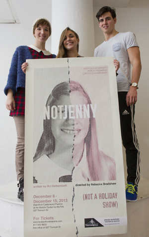
Over the course of five weeks, each group came up with five designs that were then whittled down to two, which D’Ambrosio, Halberstadt, and director Rebecca Bradshaw reviewed and offered comments on. After another round of revisions, the final posters were presented to D’Ambrosio, who selected the winning design: a sepia-toned yearbook picture of a teenage girl with a jagged line splitting the center of her face. The letters NOTJENNY are stamped like a mask over the girl’s eyes.

Grey, Halberstadt, and D’Ambrosio were impressed by the quality of all of the posters, but they say the ultimate decision came down to which poster most closely adhered thematically and emotionally to the play.
“That’s the challenge of working for clients,” Grey says. “You don’t know what they’re looking for. It may be a phenomenal poster design, but it just isn’t quite the ‘it’ design.”
“There’s something really playful about it,” Halberstadt says of the selected design. It also connects to what he calls one of his “favorite and most disgusting lines” from the play, when Jenny makes a gruesome comment while staring into her mother’s open casket.
The “it” design D’Ambrosio selected was created by Jane Fitzsimmons (CFA’15), Samantha Budow (CFA’16), and Pedro Gandarias (CFA’15), who earned free tickets to the play, which they plan to attend together.
Grey had assigned the three the theme “fragments of personal history,” and Fitzsimmons says her group played around with several symbols from the script, such as Jenny’s yearbook and Not Jenny’s diary, as inspirations for their designs. In the end, the split yearbook picture won out.
Fitzsimmons believes the project has been useful preparation for a design career. “When in class with other projects, you get a lot of feedback from the professor and other design students,” she says. “But when you get feedback from a client, the critique is more practical than design-related, which is great experience for the real world.”
The Bridge Repertory Theater of Boston’s production of not Jenny runs through Sunday, December 15, at the Calderwood Pavilion at the Boston Center for the Arts, 527 Tremont St., Boston. Tickets and more information are available here or by calling 617-933-8600. By public transportation, take any MBTA Green Line trolley to Copley. Walk one block down Boylston Street and turn right on Clarendon and left on Tremont Street. The theater is on the left.
Comments & Discussion
Boston University moderates comments to facilitate an informed, substantive, civil conversation. Abusive, profane, self-promotional, misleading, incoherent or off-topic comments will be rejected. Moderators are staffed during regular business hours (EST) and can only accept comments written in English. Statistics or facts must include a citation or a link to the citation.